


What’s in a colour? A lot, actually. Colours evoke emotions and feelings and influence how people perceive your website or product. This winter, a few colour combinations will be prevalent. This blog post discusses the meanings behind some of the most popular colours this season and gives you tips on how to use them in your fashion and design projects.
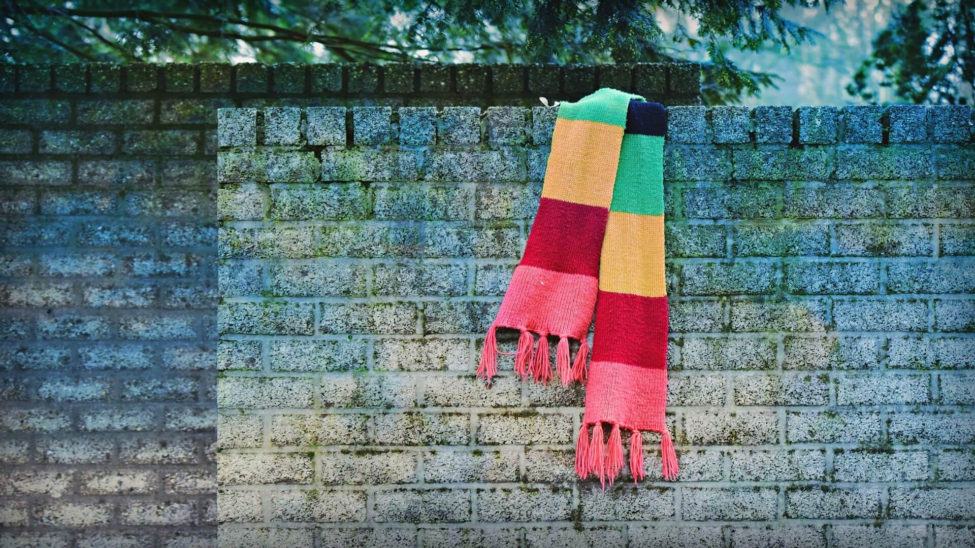
Earth tones
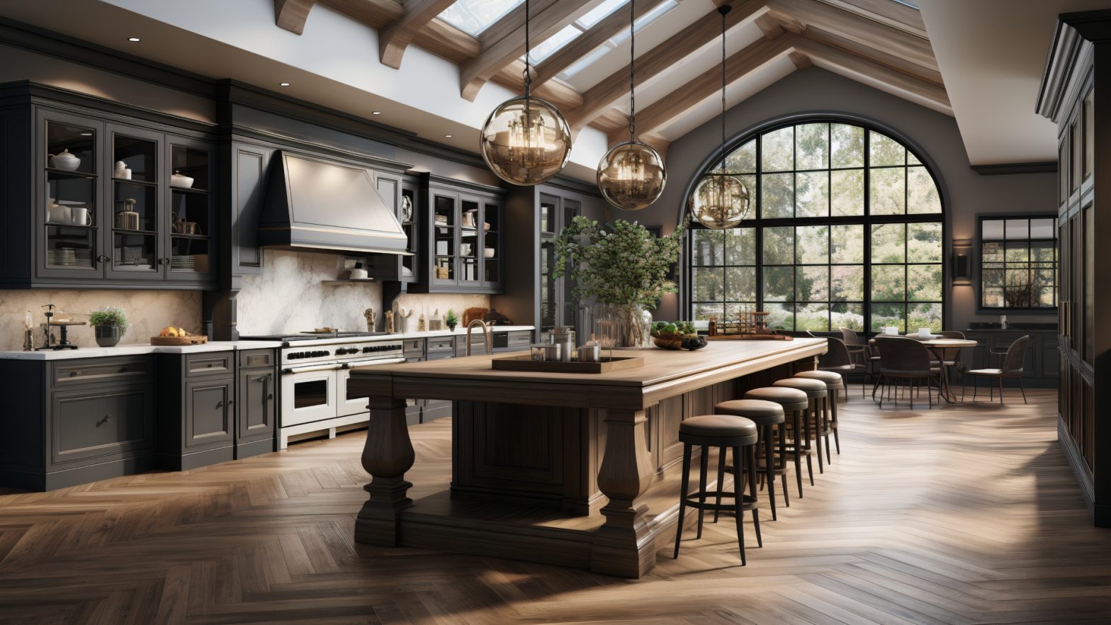
Winter may be a time for more fabulous shades, but earth tones are still popular. Earthy colours like brown, beige, taupe, and olive green evoke a sense of calmness and comfort. These muted shades can be combined with brighter hues to create an exciting contrast or stand against white and black backgrounds. For sports apparel, colours such as navy, maroon, and charcoal can create a classic look. Regarding office wear, muted tones of grey, camel, and khaki are great choices. In designing the interior of a room, earthy tones can be used as accents or to create an overall warm and inviting atmosphere.
Monochromatic shades
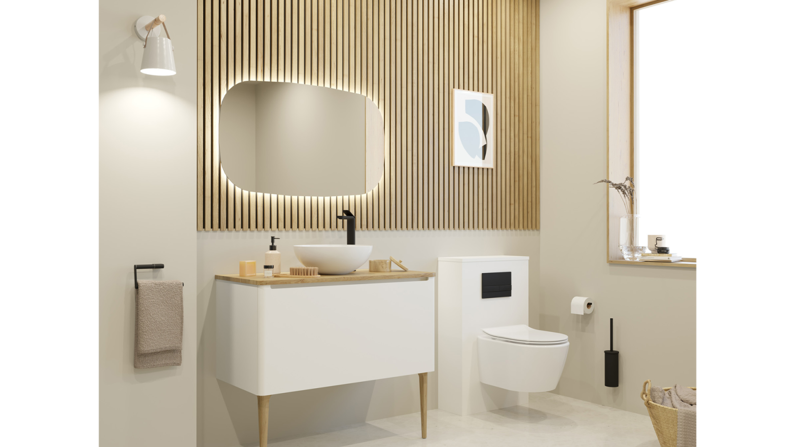
Monochromatic colour schemes are still in this season. However, lighter shades of blue, such as baby blue and light grey, are favoured instead of the dark blues and greys often seen in winter fashion. These soft colours can create an atmosphere of calmness and relaxation, or act as a backdrop for brighter accents. Regarding interior design, monochromatic schemes can also be used to create a stylish yet subtle look. If you are invited to a winter wedding, shades of white and ivory will make an elegant yet timeless statement, while a party look can be enhanced with shades of pink and purple.
Muted jewel tones
Muted jewel tones such as emerald green, sapphire blue, and amethyst purple are gaining popularity this winter. These colours can be used to create a beautiful contrast against whites and neutrals or combine them for a more vibrant look. Jewel tones can be used to dress up casual wear or add a touch of elegance to formal attire. Casual wear can be jazzed up with shades of green, blue, purple, or pink, while a more sophisticated look can be achieved by using deep jewel tones. For interior design, muted jewel tones can be combined with bolder shades like red and yellow to create an uplifting atmosphere or a regal and luxurious vibe.
Metallics
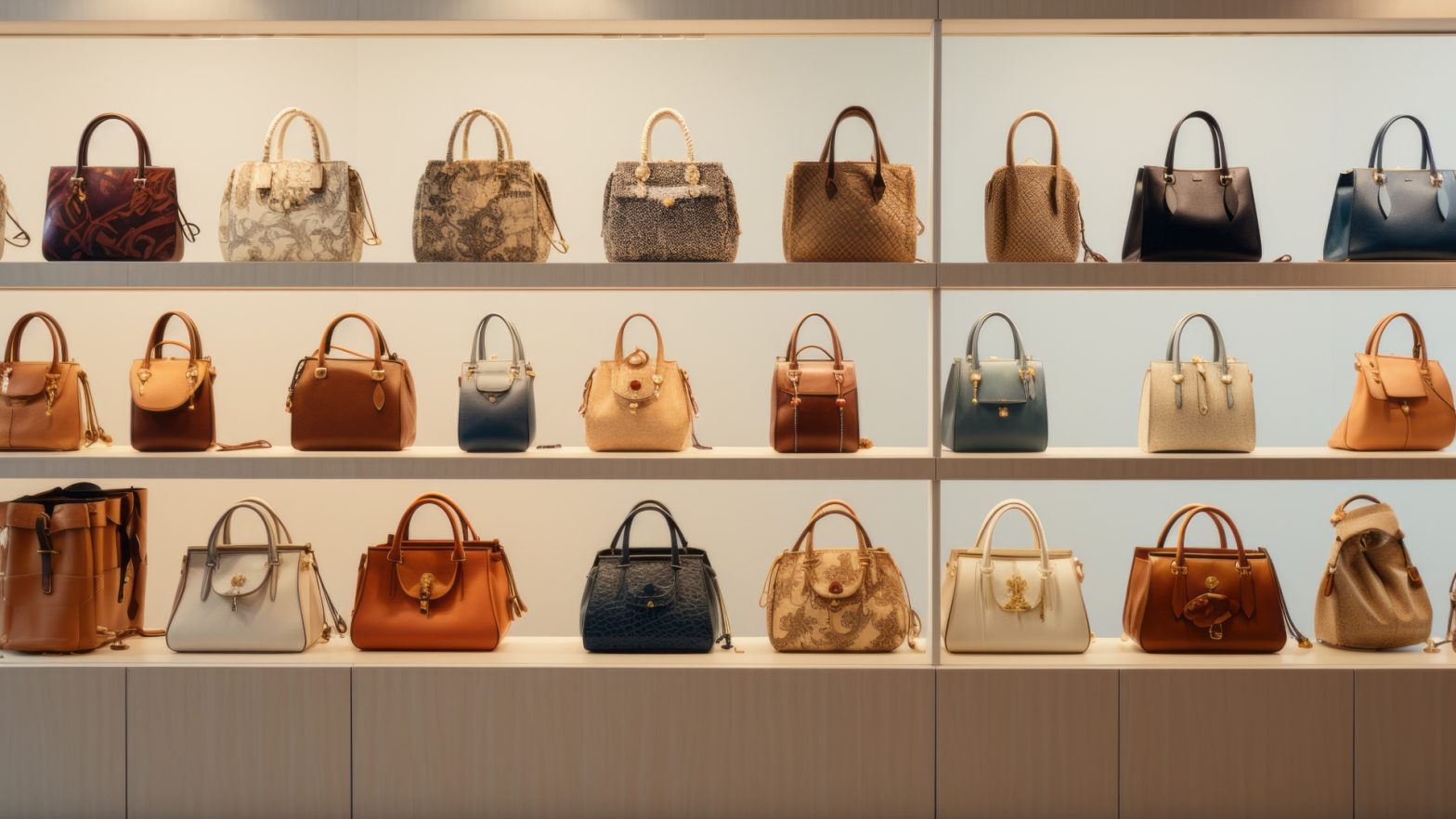
As winter approaches, metallics become more prevalent in fashion and design. Silver and gold tones convey luxury and sophistication. Bronze, copper, and rose gold are becoming increasingly common in accessories like handbags and shoes. It is vital to keep the rest of the outfit muted and minimal when using metallic colors to avoid looking too flashy. For instance, if you are wearing a gold top, pair it with neutral bottoms. Metallics can also be used in interior design to add glitz and glamor to a room. For instance, copper accents on furniture or gold frames for art pieces can instantly elevate the look of any space. The key to using metallics is sparingly, as too much of the shine can be overwhelming.
Bold blues
Some people may think that blue is too cold for winter, but bold blues are coming back this season. Shades like navy and royal blue convey confidence and elegance, while lighter shades like baby blue create a sense of calmness and serenity. For fashion, bright blues can be combined with other colors to create an exciting contrast or used to make a statement. For interior design, bold blues can create a modern and chic look or evoke a sense of serenity in a room. For instance, a couch upholstered in navy blue or a wall painted in royal blue can instantly make a room look stylish and inviting.
Mint and teal
These two colours have been trending for some time now, and you’ll see plenty of them this winter. Mint is a soft shade of blue-green that suggests freshness and innocence. It can be combined with darker shades like navy for a more sophisticated look or lighter shades like white and ivory for a more classic feel. Teal is a bolder shade that conveys tranquillity and stability. In fashion, it can create eye-catching contrast against black and grey tones or as an unexpected pop of colour in an all-neutral outfit.
Ultimately, colour combinations are essential for staying fashionable this winter. Whether you opt for muted earthy tones, monochromatic shades, muted jewel tones, metallic colours, bold blues, or mint and teal, the right combination can create a stunning look. No matter what colour combinations you choose this winter, the key is to find tones that complement each other and convey your style. With the right colours, you can have a fashionable yet timeless look that will stand out from the crowd.